Dashboard Design Principles
Best practices for creating dashboards that drive action and understanding.
Articles, guides, and perspectives on business intelligence, analytics, and automation.

Best practices for creating dashboards that drive action and understanding.
Key Performance Indicators (KPIs) are among the most frequently cited tools for translating strategy into measurable outcomes. Yet many organizations struggle to design KPIs that actually change behaviour. Too often dashboards display a long list of numbers that look authoritative but produce little operational improvement. The difference between a set of metrics that informs and one that transforms lies in intentional design.
How businesses can make smarter choices, reduce risks, and uncover opportunities by relying on data instead of intuition.
KPIs fail for a few recurring reasons: they’re vague, they’re disconnected from strategic outcomes, they’re not owned, and they create noise rather than focus. Organizations may gather data simply because it’s available, not because it meaningfully measures progress toward an objective. Or they overload teams with metrics that dilute priorities.
Designing KPIs that drive action requires discipline. Below are core principles that combine strategic clarity with practical execution.
Use a four-step process: (1) Translate strategy into measurable goals; (2) select candidate metrics; (3) validate data quality and frequency; (4) set targets and escalation paths. Iterate every quarter to ensure KPIs remain aligned with evolving priorities.
A milling plant focused on improving throughput might be tempted to track machine runtime as the primary KPI. But machine runtime alone ignores quality and output. A more effective KPI mix could be:
Each of the above points to specific actions (maintenance scheduling, operator training, supplier management), and each has a defined owner.
Visuals matter. Present KPIs in a dashboard that highlights status (green/amber/red), trend, and short contextual commentary. A KPI tile might show current value, target, trend over time, and a one-line commentary: “Action: schedule root-cause analysis for shift B.” This converts passive numbers into active prompts.
Set a governance cadence: review KPIs monthly and reassess quarterly. Remove metrics that don’t inform decisions. As the business evolves, KPIs should evolve too—reflecting new priorities, changing markets, and improved data maturity.
KPIs that drive action are concise, strategic, owned, and visual. They catalyse decisions instead of merely summarizing them. Start by aligning KPIs to strategy, pick the vital few, and embed clear ownership and action plans. With this approach, KPIs will shift from being scorecards to being the drivers of performance improvement.

Best practices for creating dashboards that drive action and understanding.
Automation eliminates repetitive tasks, increases accuracy, and empowers teams to focus on high-value work.
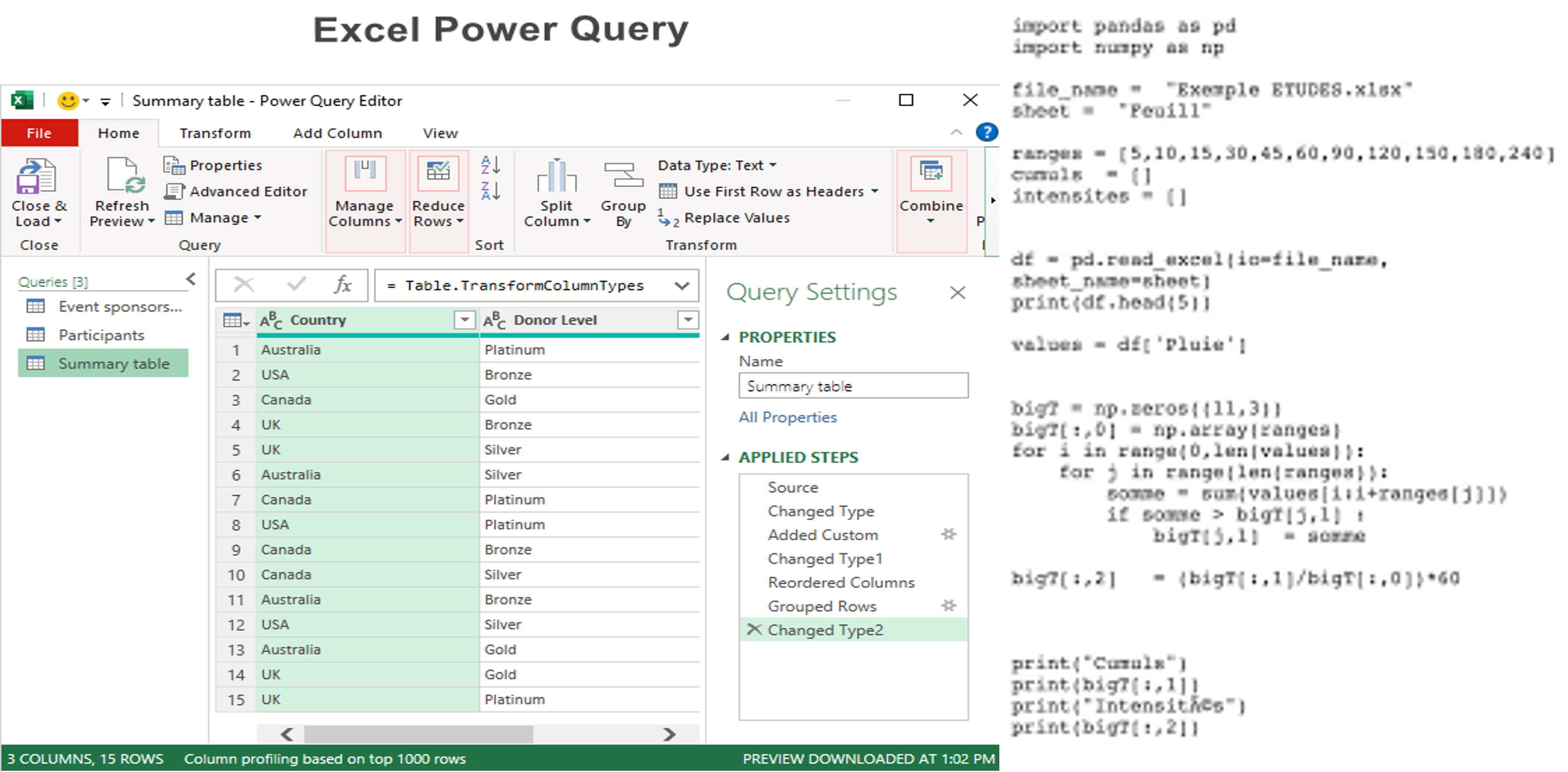
Timely and accurate reporting is the backbone of effective decision-making, yet many organizations still rely on manual workflows that consume valuable analyst time. Power Query transforms how teams collect, clean, and consolidate data, turning hours of repetitive work into a repeatable, auditable process.
Manual data preparation introduces errors, creates version control issues, and consumes time that could be used for analysis. Analysts often repeat the same transformations each reporting period, leading to low-value activity and higher frustration.
Power Query provides a GUI and a scriptable language (M) to extract, transform, and load (ETL) data within Excel and Power BI. Key capabilities include:
Best practice is to build modular queries: a staging layer for raw data import, a transformation layer for cleaning and enrichment, and a presentation layer that feeds the final model or Excel tables. This structure improves maintainability and debugging.
In a retail environment, regional managers send daily CSVs with sales records. An analyst built a folder-based Power Query that ingests all files, normalizes SKU codes, calculates channel revenue splits, and outputs a consolidated table. What used to take 6 hours per week now runs as a one-click refresh.
Using Power Query in Power BI enables scalable, scheduled refreshes and interactive dashboards. With proper data modelling (star schema) and DAX measures, teams can create performant, user-friendly reports that update automatically.
Document transformation steps and key assumptions. Use source control for M queries where possible and maintain a data dictionary so consumers understand definitions and lineage.
Power Query reduces time-to-insight by automating tedious transformations and providing a reproducible path from raw data to actionable information. Investing in well-structured queries and documentation delivers tangible time savings and more reliable reporting.

Best practices for creating dashboards that drive action and understanding.
Turn raw nzumbers into powerful stories that drive better and faster business decisions.
Data visualization is more than making charts look pretty. It’s a way to surface the right insight to the right person at the right time. The most effective visualizations turn complexity into clarity and enable faster, more confident decisions.
Introduction
Our brains are wired to detect patterns visually. A well-designed dashboard reduces cognitive load and highlights the few signals that require attention. Visualization also democratizes insights—enabling non-technical stakeholders to engage with data meaningfully.
Follow pragmatic design principles:
Structure dashboards top-to-bottom: summary KPIs, trends, drivers, and then detailed tables for operational users. Make filters and slicers obvious and consistent. Avoid redundant views that confuse users.
A cross-functional operations dashboard might include: overall throughput KPI, trend charts for production and downtime, a Pareto chart of top defect types, and a table listing corrective actions with owners. This layout enables both quick checks and deeper root-cause analysis.
Power BI, Tableau, and Looker are common choices. The tool matters less than the data model and design discipline. Ensure you have clean, documented data and a governance process to maintain dashboards over time.
Consider using small multiples for comparing many similar items, sparklines for trend context within tables, and drill-through functionality to move from summary to transaction-level detail. Annotations and dynamic commentary can dramatically improve comprehension.
Visualization is how data becomes action. With clear purpose, disciplined design, and the right tooling, businesses can unlock value from their data and encourage a culture of insight-driven decisions.

Best practices for creating dashboards that drive action and understanding.
Learn how analytics ensures growth, resilience, and efficiency in supply chain operations.
Scaling a supply chain without analytics is like navigating a storm with no radar—you're likely to encounter unexpected turbulence. Analytics brings foresight, enabling organizations to optimize inventory, forecast demand, and respond rapidly to disruptions.
As organizations grow, they face greater variability in demand, longer supply lines, and more complex supplier networks. Common issues include stockouts, excess safety stock, poor service levels, and limited visibility into supplier performance.
A mid-sized food processor faced fluctuating demand across regions. Implementing a forecast-driven procurement process and optimizing SKU placement cut inventory by 18% while improving service levels. The company moved from reactive firefighting to planned replenishment cycles.
Analytics is only useful when teams trust and use the outputs. Invest in change management: training for planners, transparent scorecards for suppliers, and clear escalation paths for exceptions.
Analytics enables supply chains to scale intelligently. Start with data hygiene, pick pragmatic pilots, and move toward operational automation. Over time this reduces costs, improves service, and makes growth manageable.

Best practices for creating dashboards that drive action and understanding.
Why moving beyond spreadsheets to Power BI unlocks collaboration, speed, and real-time insights.
Excel has powered analysis for decades. Its flexibility is unmatched, but as businesses grow in data volume and complexity, Excel's limitations—versioning, collaboration, and scalability—become apparent. Power BI addresses these challenges by offering centralized datasets, interactive visuals, and easier sharing.
Introduction
Warning signs include long refresh times, multiple conflicting versions of the same report, and manual reconciliation. When stakeholders can't trust or access the same numbers, decisions slow and confidence erodes.
A national retailer consolidated regional Excel reports into a Power BI dataset. Managers could now analyze sales in real time, drill into underperforming SKUs, and coordinate promotions across regions. Reporting time dropped from days to hours.
Shifting from Excel to Power BI is a change in mindset as much as technology. Start small, focus on high-impact reports, and invest in training and governance to ensure long-term success.
Best practices for creating dashboards that drive action and understanding.
Save hours by automating manual reporting processes while improving accuracy and speed.
Organizations often waste analyst time on repeatable tasks—copying files, cleansing data, and formatting reports. Combining Power Query's transformation power with VBA's automation capabilities creates robust end-to-end workflows that save time and reduce errors.
Power Query excels at repeatable, auditable data transformations, while VBA automates Excel-level actions: refreshing queries, applying templates, exporting files, and emailing outputs. Together they cover the full lifecycle of many reporting processes.
A logistics business automated its weekly KPI pack. Power Query consolidated data from transport logs; VBA refreshed the model, updated charts, exported a PDF, and emailed it to executives. The automation reduced manual effort from 4 hours to under 10 minutes.
Power Query and VBA together provide a practical automation strategy for Excel-first teams. Implemented well, they free analysts from manual tasks and create consistent, reliable reporting processes.
Best practices for creating dashboards that drive action and understanding.
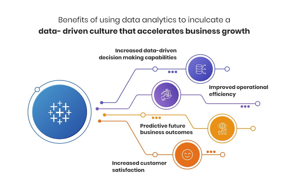
How organizations can thrive by embedding data into every decision, building resilience and innovation.
Tools and technology are important, but culture determines whether data becomes a habit or a novelty. A data-driven culture empowers teams to use evidence in daily decisions, improving outcomes and creating competitive advantage.
Common obstacles include leadership inertia, data silos, lack of data literacy, and fear of transparency. Overcoming these requires deliberate effort and sustained leadership commitment.
A logistics firm introduced a daily operational scoreboard shared across sites. The visibility and routine discussion it created led to a 20% reduction in delivery exceptions within six months—the result was driven as much by regular review and ownership as by the scoreboard itself.
Becoming data-driven is a journey, not a project. Start with executive support, deliver quick wins, invest in people, and build governance. Over time, data will shift from being an input to being the language of decision-making across the organisation.

How to foster a culture where data informs decisions at every level of your organization.
Many organizations invest heavily in sophisticated analytics tools and high-end data infrastructure, only to find that their decision-making processes remain rooted in "gut feel" or hierarchy. A data-driven culture isn't purchased; it is built through a deliberate shift in mindset, literacy, and accessibility. It is the environment where data is not just an output of the IT department, but the primary language of the boardroom and the shop floor alike.
Fostering this culture requires moving beyond technical implementation to address the human element of digital transformation.

The transition often stalls due to a "Data-Strategy Gap." Employees may feel intimidated by complex dashboards, or they may lack the autonomy to act on what the data suggests. When "Highest Paid Person’s Opinion" (HiPPO) consistently overrides empirical evidence, the incentive to use data vanishes. To succeed, organizations must dismantle these silos and democratize information.
Creating a sustainable culture where data informs every level of the organization rests on four critical pillars:
Fostering this culture is an iterative process: (1) Identify a small, high-impact business problem to solve with data; (2) empower a cross-functional team with the necessary tools; (3) communicate the "win" across the company to build momentum; (4) scale the training and access to other departments. Repeat this cycle to normalize data-backed storytelling.
Consider a retail chain struggling with inventory management. In a traditional culture, store managers might order stock based on what "feels" busy. In a data-driven culture:
The data becomes a "quiet advisor" in the background of every task, rather than a separate chore to be completed at the end of the month.
Data should move from being descriptive (what happened) to prescriptive (what should we do?). High-performing cultures move beyond static PDFs and toward interactive environments where data is used to test hypotheses. "We think X will happen, let's run a pilot and check the data" becomes the standard operating procedure.
Building a data-driven culture is a marathon, not a sprint. It requires a blend of technical capability and cultural change management. By prioritizing literacy, democratization, and evidence-based leadership, you transform data from a cold commodity into a strategic asset. When data informs decisions at every level, the organization becomes more resilient, transparent, and ultimately, more profitable.

Measuring the impact of automation on productivity, accuracy, and employee satisfaction.
As organizations move beyond simple task automation toward Intelligent Automation (IA)—combining robotic process automation with cognitive technologies—the conversation inevitably shifts to Return on Investment (ROI). While the initial appeal of automation is often cost reduction, the true value lies in a broader spectrum of performance improvements that redefine operational excellence.
Calculating the impact of IA requires looking beyond the "hours saved" and assessing how technology elevates the fundamental capabilities of the workforce.

The most common mistake in measuring automation ROI is focusing solely on Full-Time Equivalent (FTE) savings. While reducing labor costs is a tangible metric, it is often a lagging indicator. Intelligent Automation delivers its most significant returns by eliminating "Structural Debt"—the inefficient workflows that accumulate over time—allowing the business to scale without a linear increase in overhead.
To capture the full picture of ROI, organizations should measure impact across three distinct but interrelated domains:
To build a robust business case, follow a multi-layered approach: (1) Baseline current manual process costs; (2) Account for implementation and maintenance (licensing, infrastructure, governance); (3) Quantify "Value-Linkage" (how faster processing leads to better cash flow); and (4) Track qualitative shifts in team morale and innovation output.
A firm implementing IA for loan processing might see a modest 15% reduction in direct labor costs. However, the true ROI emerges elsewhere:
When calculating ROI, the "Cost of Doing Nothing" (CODN) is a vital metric. In an increasingly automated landscape, relying on manual processes creates a bottleneck that limits agility. The inability to respond to market shifts or customer demands as quickly as automated competitors is a silent drain on market share.
The ROI of Intelligent Automation is a composite of efficiency, quality, and human potential. While the numbers on a spreadsheet provide the justification, the real transformation is seen in an organization that is faster, more accurate, and more human-centric. By measuring the right metrics, leaders can turn automation from a technical expense into a strategic engine for growth.

Techniques for building resilient forecasting models that adapt to changing conditions.
In a global economy defined by rapid shifts and "black swan" events, traditional linear forecasting is becoming obsolete. When the past is no longer a reliable predictor of the future, organizations must pivot from rigid predictions to resilient, adaptive modeling. The goal of modern forecasting isn't to be "right" about a single number, but to be prepared for a range of possibilities.
Building resilience into your financial and operational models requires a move away from static spreadsheets and toward dynamic, driver-based simulations.

Most forecasting failures stem from "anchoring bias"—the tendency to rely too heavily on historical data while ignoring emerging signals. Traditional models often fail because they are built on fixed assumptions that don't account for external volatility, such as supply chain disruptions or sudden shifts in consumer behavior. To survive uncertainty, models must be "stress-tested" against extreme scenarios.
To build models that adapt rather than break, consider integrating these core technical approaches:
Success requires a structured approach to data governance: (1) Define your high-impact drivers; (2) Automate data ingestion to reduce manual entry errors; (3) Establish a regular cadence for scenario reviews; and (4) Foster a culture where "adjusting the plan" is seen as a strength, not a failure of the original budget.
A distributor facing fluctuating shipping costs and lead times might move away from a fixed "expected arrival" model. Instead, they implement an adaptive model that:
This transforms the forecast from a passive report into an early-warning system for the procurement team.
A resilient forecast should be visualized through "Confidence Intervals." Rather than showing a single line, show a shaded area representing the range of likely outcomes. This visually communicates uncertainty to stakeholders and prevents the "illusion of precision" that often leads to poor strategic choices.
Forecasting in uncertain times is about agility, not accuracy. By shifting to driver-based, rolling, and scenario-oriented models, you provide your organization with a roadmap that can be rewritten in real-time. Resilient models don't just predict the future—they provide the clarity needed to navigate it, regardless of which scenario unfolds.

Strategies for aligning technical teams with business objectives.

An overview of the tools and technologies powering modern data platforms.

Best practices for creating dashboards that drive action and understanding.
The primary purpose of a dashboard is not to display data; it is to facilitate decision-making. A well-designed dashboard acts as a cognitive shortcut, allowing users to process complex information and identify necessary actions within seconds. However, many dashboards suffer from "information clutter," where the signal is lost in a sea of unnecessary gauges, colors, and tabs.
Mastering dashboard design requires a blend of visual psychology and a deep understanding of the user's operational goals.

A successful dashboard should pass the "Five-Second Rule": a user should be able to grasp the general health of the business or process within five seconds of looking at the screen. If they have to hunt for the most important number, the design has failed. This is achieved through a strict visual hierarchy where the most critical KPIs are placed in the top-left corner—the area where the human eye naturally starts scanning.
To move beyond simple charts and create truly actionable interfaces, follow these foundational principles:
Adopt a user-centric design process: (1) Identify the specific persona (e.g., Executive vs. Manager); (2) Define the "Key Question" they need to answer every morning; (3) Wireframe the layout focusing on data density; and (4) Iterate based on real-world usage. A dashboard is a living tool, not a static piece of art.
Instead of just showing a list of every sale made this month, an actionable sales dashboard might feature:
This structure moves the user from "How are we doing?" to "Why is this happening?" and finally to "What should I do right now?"
Every element on your dashboard should fight for its right to be there. Remove "chart junk"—redundant grid lines, excessive borders, and decorative images. Maximize the "Data-to-Ink Ratio" by ensuring that every pixel on the screen is serving the purpose of communicating information clearly.
Effective dashboard design is the bridge between raw data and human intelligence. By prioritizing hierarchy, providing context, and ruthlessly eliminating clutter, you transform a passive reporting tool into a driver of organizational performance. Remember: the best dashboard is the one that leads to the best decision in the shortest amount of time.
Enjoyed our perspective? Let's discuss how these frameworks and automated solutions can be applied to your specific business operations.